[Tutorial Kit] Infographics for Social Media: Air Quality
- Shamini V De Silva
- May 21
- 5 min read
Updated: 2 days ago
Video Timestamps
00:29:09 - What is PM2.5
01:52:15 - Step-by-Step
02:02:03 - Data Hunt
03:05:16 - Canva Sheets
05:49:10 - Infographic!
🎯 Data Challenge
Create an infographic for social media about air pollution in your community.

3 Learning Objectives
Identify, query, and collect 📊 public, secondary data on PM 2.5 for a selected community or region.
Analyze a selected air quality indicator to determine the health status of a population 🧰 🛠️
Develop a data visualization or infographic 🎨 that communicates an air quality–related message to a defined stakeholder or target audience.
Conflicts of Interest Disclosure
There are no financial conflicts of interest to disclose. None of the presenters or organizers of this event have any financial relationship, nor affiliation with the brands and organizations mentioned in this tutorial. We just really like Canva.
Prerequisites. Beginner-friendly, no prior experience needed
Keywords and core concepts also covered:
Spreadsheet formulas (e.g., concatenate, if/then) in 🧰 🛠️ Canva Sheets
How do we measure air pollution and why does it matter to health?
Defining the EPA primary (health-based) standards for air pollution.
What you'll need to complete this data challenge
⏰ Time: 20-40 minutes
🧰 Tools:
An account in Canva.
🎨 Design Template in Canva
📊 Data:
Indicator: PM2.5: Highest Annual Average Concentration (Monitor + Modeled Data), 2020, by County.
Data Source: National Environmental Public Health Tracking Network, Data Explorer tool. https://ephtracking.cdc.gov/DataExplorer/
Key Terms and Definitions
PM2.5 (or PM2.5) is fine particulate matter that is 2.5 micrometers (i.e. microns, µm) in diameter or smaller.
PM2.5 concentration (µg/m³) is measured as particle weight (micrograms, µg) for every cubic meter of air (m³).
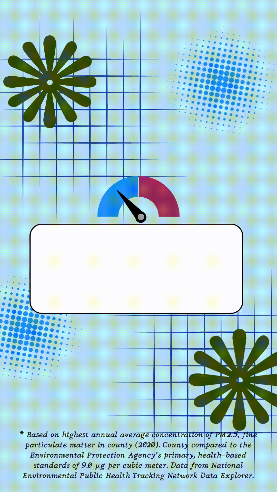
The primary (health-based) standard for PM2.5. The Environmental Protection Agency's (EPA's) annual National Ambient Air Quality Standard (NAAQS) for fine particulate matter (PM2.5) is 9.0 µg/m³. Above 9.0 µg/m³ is considered harmful to health (EPA, 2025).
What is PM2.5 and Why Does It Matter?
PM2.5 refers to fine particulate matter that is 2.5 micrometers or smaller—about 30 times thinner than a human hair. These particles come from sources like vehicle emissions, wildfires, and fossil fuel combustion (United States Environmental Protection Agency, 2023). Because they are so small, they can enter the lungs and bloodstream, increasing the risk of heart disease, stroke, asthma, and poor birth outcomes (United States Environmental Protection Agency, 2024).
Step-by-Step Walkthrough
Overview
In this tutorial, you’ll use Canva and to organize air quality data and turn it into a visual infographic video. Built-in formulas within Canva Sheets will automatically generate a clear, shareable message about air pollution in your selected county.
Step 1: Open Canva Sheets
Log in to your Canva account. If you do not have an account, you can create one for free.
Go to the Canva Sheets template and click ‘Edit template’ to create your own copy of the project.
Familiarize yourself with the layout of the Pages:
Canva Sheets on page 2,
Instructions on page 3 and 4,
followed by examples and templates
On the Canva Sheets page, start a row: Enter your name and your chosen county.
Step 2: Collect PM2.5 Data
In the Query Panel, select:
STEP 1: CONTENT
Content Area: Air Quality
Indicator: Current and Historical Air Quality
Measure: PM2.5 (highest annual average concentration, monitored + modeled)
STEP 2: GEOGRAPHY TYPE: State by County
STEP 3: GEOGRAPHY: Choose state
STEP 4: TIME: 2020
STEP 5: ADVANCED OPTIONS: No Advanced Options
Click Button: GO
Locate your county on the map and record the PM2.5 value (e.g., 7.9 µg/m³).

Step 3: Input Data into Canva Sheets
Enter the PM2.5 value under the designated column
The sheet will automatically:
Compare it to the EPA primary, health-based standard (9.0 µg/m³)
Label it as higher or lower
Calculate the PM2.5 level as a percentage of the EPA standard
Generate a short statement or phrase (e.g., “Air pollution in Orleans Parish, LA is lower than the recommended EPA health-based threshold.”)
Step 4: Choose an Infographic Template
Scroll to the bottom of the Canva file to find infographic designs.
Select a design that fits your message
Look for features like:
Gauges or indicators
Space for text and data
Clean, readable layouts
Step 5: Customize Your Infographic
Duplicate your chosen template page
Update:
Title (your name + county)
PM2.5 value
Comparison (high/low)
Generated statement
Optional:
Adjust visual elements (e.g., move gauges to reflect pollution level)
Add simple animations using the “Animate” feature
Please watch the video above for more details. Timestamps are provided.
Step 6: Link Your Infographic to the Sheet (optional)
In Canva Sheets, go to your row and under the column titled ‘CANVA PAGE LINK’, press Ctrl + K
Navigate to your page in the list and select it to link it in the cell.
This allows quick navigation between your data and design and is useful if you have data for many counties.
Step 7: Download Your Final Output
Navigate to the page with your infographic
Click Share (in the top right corner) → Download
Select file type:
MP4 for video
PNG or JPEG for static images
Select ‘Current page’ → ‘Done’ → ‘Download’
Final Takeaway
Canva Sheets makes it easy to combine data + design in one place. By linking real-world air quality data to visual storytelling, you can create engaging, accessible public health infographics for social media, reports, or presentations.
You've Earned a Certificate! | |
BroadStreet Certificate (FREE) | |
CPH - Certified in Public Health Recertification Credits (1 credit hr) ($10) | |
Note: We review projects every 2-4 weeks, and typically at the end of the month.
Examples of Infographics for Social Media
Portrait style (1080 x 1920 px) movies (.mov, .mp4) can be used for TikTok, Instagram Reels, YouTube Shorts, etc.

Instructors
 | Janelle James, MPH BroadStreet Institute Janelle is a dedicated final-year student at the Tulane University Celia Scott Weatherhead School of Public Health and Tropical Medicine, where she is pursuing her Master of Public Health in Community Health Science. A passionate advocate for community wellness, she is particularly passionate about addressing maternal and child health issues, recognizing the ongoing challenges posed by high mortality rates and the need for comprehensive care access. Connect with Janelle on LinkedIn |
 | Tracy Flood MD PhD President and Co-founder BroadStreet Institute Dr. Flood has over a decade experience in foraging for community health data, as well as in data visualization, report writing, mapping, and data design for software. She is passionate about empowering community change, increasing data literacy, and turning data into actions that will have long-term impact. She has worked with over 2,000 interns as President of BroadStreet. Connect with Tracy on LinkedIn |
References
Bekkar, B., Pacheco, S., Basu, R., & DeNicola, N. (2020). Association of air pollution and heat exposure with preterm birth, low birth weight, and stillbirth in the US: A systematic review. JAMA Network Open.
Bowe B, Xie Y, Yan Y, Al-Aly Z. (2019). Burden of Cause-Specific Mortality Associated With PM2.5 Air Pollution in the United States. JAMA Network Open. 2019;2(11):e1915834. doi:10.1001/jamanetworkopen.2019.15834
Congressional District Health Dashboard, Why Do We Measure Air Pollution? https://www.congressionaldistricthealthdashboard.org/metric/air-pollution-particulate-matter
Parasin, N., Amnuaylojaroen, T., & Saokaew, S. (2024). Prenatal PM2.5 exposure and its association with low birth weight: A systematic review and meta-analysis. Toxics, 12(7), 446. https://doi.org/10.3390/toxics12070446
Sethi, Y., Mehta, S., Padda, I., Marlecha, P., & Moinuddin, A. (2026). Impact of PM2.5 exposure on cardiovascular diseases [IPEC Study]: An updated umbrella review of systematic reviews and meta-analyses. European Journal of Preventive Cardiology.
University of Wisconsin Population Health Institute. (2025). County health rankings & roadmaps. Retrieved from https://www.countyhealthrankings.org
United States Environmental Protection Agency. (2023, July 11). Particulate matter (PM) basics. United States Environmental Protection Agency. https://www.epa.gov/pm-pollution/particulate-matter-pm-basics
United States Environmental Protection Agency. (2024, July 16). Health and Environmental Effects of Particulate Matter (PM). US EPA. https://www.epa.gov/pm-pollution/health-and-environmental-effects-particulate-matter-pm