[Tutorial Kit] Measles Immunization Coverage Rates: Building a Community Narrative

Updated: Aug 18
Workshop Chapters
Note: Parts of this video were recorded live
00:00 Introduction: Turn immunization data into a story
00:19 The 95% threshold
01:06 Data Challenge Steps
01:21 📊 Data Hunt
01:46 Understanding data limitations
02:10 Airtable Project Overview
03:52 What is Airtable?
04:55 Go to Airtable
05:24 Collect data
06:15 Compare county rates to recommended rates
07:19 Airtable bonus views
07:52 Final project and next steps
Continuing Educational Credit
CHES® / MCHES®
BroadStreet Institute is a designated provider (ID# 1167363) of continuing education contact hours (CECH) in health education by the National Commission for Health Education Credentialing, Inc. Total contact hours earned 1 • Entry-level contact hours earned 1 • Advanced-level contact hours earned 0.
CPH (Certified in Public Health) Recertification Credits
The BroadStreet Institute is an approved provider of Certified in Public Health (CPH) Recertification Credits by the National Board of Public Health Examiners. Up to 1 CPH Recertification Credits may be earned at this event.
🎯 Data Challenge
Create a data narrative or "data story" about measles immunization coverage rates in your county and how rates compare to the recommended community immunity threshold of 95%.
3 Learning Objectives
Identify and procure secondary data on measles immunization coverage and confirmed measles case counts for a selected county or region.
Analyze secondary data using a data management tool to determine the immunization coverage status of the county population relative to the community immunity threshold.
Develop a data-driven narrative statement communicating measles immunization coverage and outbreak risk, suitable for use in a Community Health Needs Assessment or grant proposal.
Conflicts of Interest Disclosure
There are no financial conflicts of interest to disclose. None of the presenters or organizers of this event have any financial relationship, nor affiliation with the brands and organizations mentioned in this tutorial. We just really like Airtable.
Prerequisites. Beginner-friendly, no prior experience needed. A free Airtable account will be needed.
Keywords and core concepts also covered:
What is 🧰 🛠️ Airtable?
Basics of inputting and organizing data in 🧰 🛠️ Airtable
How do we measure "Immunization Coverage %" and what threshold matters for health?
What you'll need to complete this challenge
⏰ Time. 20-40 minutes
🧰 Tools: Airtable.
A free Airtable Account
READ-ONLY TEMPLATE Airtable Base: https://airtable.com/apptbXMpF4U81usGH/shr5znBBro2g8ReJb
An editable copy of this read-only template is needed to complete this challenge. Make a copy to your workspace by clicking the link: "Copy base". Instructions in Step 1.
📊 Data:
Indicators:
Immunization Coverage (%) defined as the percent of a population that has immunity to measles. Immunity is estimated by the percent of people who have received two doses of the measles vaccine. Note: State definitions vary in regards to population age group, vaccine type and number of doses, and years (CORI, 2026).
Community immunity threshold is defined as the county immunization coverage needed to prevent a measles outbreak. The recommended threshold is 95% (Measles & Rubella Partnership, 2026).
Number of Confirmed Measles Cases in a specific county or region (2025-2026).
Data Source:
Center for Outbreak Response Innovation (CORI). (2026). CORI: US Measles Cases 2025-2026. ArcGIS Online. https://gisanddata.maps.arcgis.com/apps/dashboards/dd314001921f4d2eac160f89ded0b49a
Turning Immunization Coverage Into a Data Story With Airtable
This walkthrough shows how to use Airtable to organize measles immunization coverage data and then to transform it into a clear public health narrative.
The project focuses on vaccination coverage also referred to as "immunization coverage" and, specifically: MMR (measles, mumps, rubella) vaccination rates as an estimate of immunization rates. Note: State reporting and definitions may and include 1 dose, 2 doses, or the childhood “7-vaccine series.”
The objective is to compare county vaccination coverage against the World Health Organization-recommended community immunity threshold of 95% (Measles & Rubella Partnership, 2026).
By the end, you will create a short statement, suitable for Community Health Needs Assessments or Community Health Assessment, that explains whether a county may be at increased risk for a measles outbreak.
Step 1: Set Up Your Airtable Workspace
What is Airtable? Airtable is an alternative to spreadsheets (i.e. Excel, Google Sheets) and is powerful tool for managing and presenting information clearly. Key features include:
Basic Features
FILTER and GROUP data to focus on specific indicators
HIDE fields that are not currently needed
VIEW Different table formats to organize information
More Advanced Features
AI-generated summaries that help create narrative insights from your data
Automations
For this tutorial:
Log in to Airtable or 'Sign Up for Free' and create an account by verifying your email and following the instructions provided by Airtable.
Open the READ-ONLY TEMPLATE Airtable Base. Follow the instructions above to ‘Copy base’ to your own workspace for editing. Note: This step is not included in the video of the live workshop.

Copy the READ-ONLY Template to create an editable copy in your own workspace. Changes to your copy will not be viewable by others. Open your EDITABLE COPY of the Base.
Go to:
TAB or TABLE: 'START HERE 🏁'
VIEW: 'Grid View'
See the Grid (or Spreadsheet) with rows
Next, in the first column of the Grid, under the last row, click on the ‘+’ symbol to add a new row and start by entering the following under the appropriate fields:
the name of your chosen county
the state of the county. Select from a dropdown.
Step 2: Collect Data From The CORI Measles Dashboard
Go to the Center for Outbreak Response Innovation (CORI) Measles Dashboard.
Once on the page, navigate to the bottom right and click on the bar to select the tab: 'US Immunization Coverage'

Filter for your state at the top by clicking on 'Filter by US State(s)' on the top right.
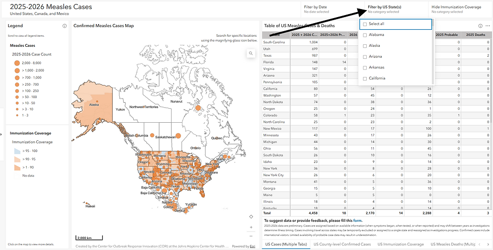
Find ‘% Coverage’
Look up the immunization coverage percent for your county under the column ‘% Coverage’
Alternatively, find the county on the map to the left, click on it and access the data via the pop-up


To find Measles data,
Navigate once again to the bar at the bottom of the table and select ‘US County-level Confirmed Cases’
Access the data for ‘2025-2026 Confirmed Cases’ via the table or the map

Step 3: Add Data to Your Airtable Base
Fill in the field ‘Immunization Coverage Definition' (Vaccine type, Age, Years)’ using information in CORI Measles Dashboard 'US Immunization Coverage’ tab for the ‘Immunization’, ‘Population’, and ‘Year’ columns.
Record the values you obtained for immunization coverage and number of confirmed cases in your chosen county.
In Airtable, the field 'Community Immunity Threshold (95%)' will automatically populate as ‘95%’ based on the Measles & Rubella Partnership (2026).
Please watch the video above for a walkthrough of these steps.
Step 4: Use Airtable Formulas to Create a Narrative Phrase
This base contains multiple formula fields which auto-populate based on the data you enter. For example:
The field ‘County Immunization Coverage (%) vs Community Immunity Threshold’ will automatically compare your county’s immunization coverage to the recommended 95% threshold and indicate whether it is ‘lower’ or ‘higher’ with 'higher' indicating good coverage.
A prebuilt formula automatically converts your data into a public health narrative phrase such as: “In Oconto County, Wisconsin, there were 36 confirmed measles cases. Vaccination coverage was 81%, which is below the recommended community immunity threshold of 95%. This may increase the risk of measles transmission in the community.”
Data and formulas can transform raw numbers into a meaningful data story suitable for:
Community health needs assessments
Health reports
Grant proposals
Public health summaries
Step 5: Finalize and Submit Your Work
Before finishing:
Add the dashboard link as your data source
Update your status field to 'Done.'
Take a screenshot of your completed Airtable record and submit below for a certificate!
Example Screenshots


You've Earned a Certificate! | |
BroadStreet Certificate (FREE) | |
CHES® / MCHES® Credit1 total credit hours ($10) | |
CPH - Certified in Public Health Recertification Credits (1 credit hr) ($10) | |
Note: We review projects every 2-4 weeks, and typically at the end of the month.
Instructor
 | Diana Saad, MPH Data for Change Program Coordinator BroadStreet Institute Diana has a passion for exploring data and using tools like Airtable and over the past year has worked with dozens of trainees on Airtable setup, indicator exploration, data stories, and logic models. Diana is passionate about health and wellness, specifically for women and children. |
References
Data Source:
Center for Outbreak Response Innovation (CORI) at the Johns Hopkins Center for Health Security (2026). 2025-2026 Measles Map. Retrieved from https://gisanddata.maps.arcgis.com/apps/dashboards/dd314001921f4d2eac160f89ded0b49a.
Measles & Rubella Partnership (2026). Measles Outbreak Strategic Framework 2026–2030. Retrieved from https://measlesrubellapartnership.org/wp-content/uploads/2026/05/MRP_MOSF_L5.pdf
![[Tutorial Kit] Using RStudio to Analyze and Visualize Air Quality](https://static.wixstatic.com/media/3aa850_c0c05ce650db48f5a26865929166c978~mv2.png/v1/fill/w_980,h_551,al_c,q_90,usm_0.66_1.00_0.01,enc_avif,quality_auto/3aa850_c0c05ce650db48f5a26865929166c978~mv2.png)
![[Tutorial Kit] Infographics for Social Media: Air Quality](https://static.wixstatic.com/media/3aa850_71d5f1db4cf94ed9ad0b7ee2c1a20dcc~mv2.png/v1/fill/w_980,h_551,al_c,q_90,usm_0.66_1.00_0.01,enc_avif,quality_auto/3aa850_71d5f1db4cf94ed9ad0b7ee2c1a20dcc~mv2.png)